# Note: you may need to first install the openintro package by running
# install.packages("openintro") directly in your R console

# Unpacking our tools and equipment
library(tidyverse)
library(openintro)
library(infer)SDS 220: Lecture 16 Handout
Bootstrap Confidence Intervals
Exit Polls
Using exit polls, polling organizations predict winners after learning how a small number of people voted, often only a few thousand out of possibly millions of voters.
After sampling 3889 randomly selected voters, 53.1% said they voted for Brown, 42.4% for Whitman and 4.5% for other candidates or gave no answer.
At the time of the exit poll, the percentage of the entire voting population (nearly 9.5 million people) that voted for Brown was unknown.
Getting Started
Let’s start by setting up our R coding environment! In this handout, we will use functions from the tidyverse package and data from the openintro package; we’ll go ahead and load those packages now:
Introducing the Data
To answer the question, we will again use a simulation. We will use a bootstrapping in order to better understand the behavior of the statistic. We will first create the original data set.
polls <- tibble(
  candidate = c(rep("Brown", 2065), rep("Other", 1824))
)
We can quickly visualize the distribution of these responses using a bar plot.
ggplot(polls, aes(x = candidate)) +
  geom_bar() +
  labs(
    x = "", y = "",
    title = "Voter results"
  ) +
coord_flip() 
We can also obtain summary statistics to confirm we constructed the data frame correctly.
polls %>%
  count(candidate) %>%
  mutate(p = n /sum(n))
# A tibble: 2 × 3
candidate n p
<chr> <int> <dbl>
1 Brown 2065 0.531
2 Other 1824 0.469Multiple Bootstrap Samples
Not surprisingly, every time you take another random sample, you might get a different sample proportion. It’s useful to get a sense of just how much variability you should expect when estimating the population mean this way. The distribution of sample proportions, called the sampling distribution (of the proportion), can help you understand this variability and behavior of a statistic. We do not have access to this though, so we will use a bootstrap sample.
sample_props <- polls %>%
                  rep_sample_n(size = 3889, reps = 15000, replace = TRUE) %>%
                  count(candidate) %>%
                  mutate(p_hat = n /sum(n)) %>%
                  filter(candidate == "Brown")
And we can visualize the distribution of these proportions with a histogram.
ggplot(data = sample_props, aes(x = p_hat)) +
  geom_histogram( color = "white") +
  labs(
    x = "p_hat (Brown)",
    title = "Bootstrap distribution of p_hat",
    subtitle = "Sample size = 3889, Number of samples = 15000"
  )
`stat_bin()` using `bins = 30`. Pick better value with `binwidth`.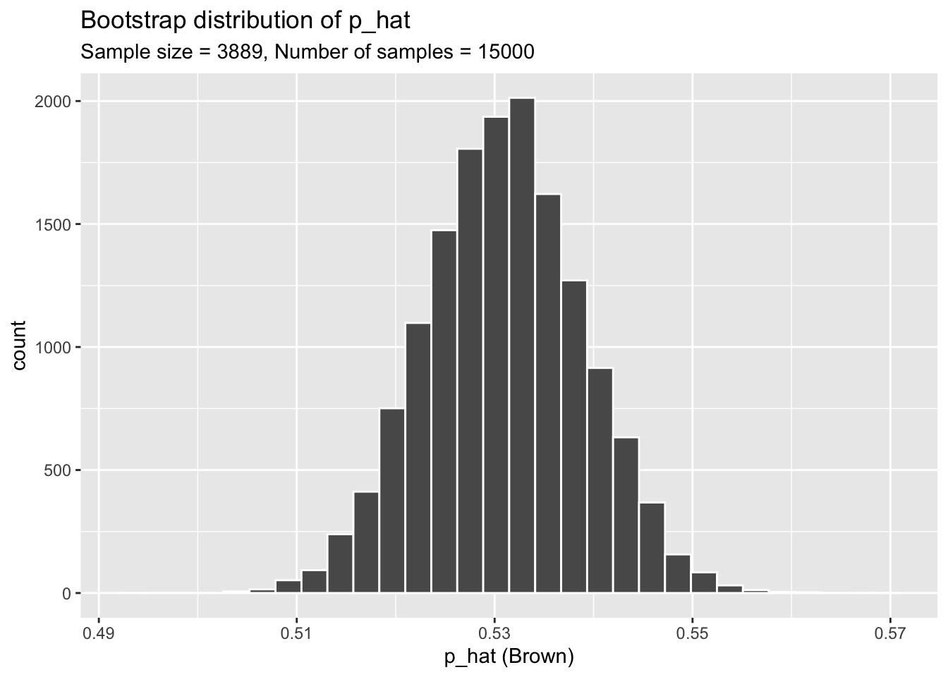
Our sampling distribution has its own mean and standard deviation which we can calculate.
mean(sample_props$p_hat)[1] 0.5309611sd(sample_props$p_hat)[1] 0.007950075The Bootstrap Confidence Interval
To obtain a confidence interval (the most plausible values for a parameter), we need to find the upper bound and lower bound of the middle most values.
If we want a 95% confidence interval, then to calculate the lower bound we want the \(2.5^{th}\) percentile, and the upper bound is the \(97.5^{th}\) percentile.
We can find the values using the quantile() function.
lower <- quantile(sample_props$p_hat, 0.025)
lower
2.5%
0.5155567 upper <- quantile(sample_props$p_hat, 0.975)
upper 97.5%
0.5466701 The first argument of the quantile() function is the data to find the percentiles for. The second argument is the percentile of interest.
Plotting the Confidence Interval Regions
We can add a layer to the ggplot figure using the function geom_vline(). The first argument is indicating where the line should go, and the second argument is changing the color.
ggplot(data = sample_props, aes(x = p_hat)) +
  geom_histogram( color = "white") +
  labs(
    x = "p_hat (Brown)",
    title = "Bootstrap distribution of p_hat",
    subtitle = "Sample size = 3889, Number of samples = 15000"
  )+
  geom_vline(xintercept = lower, colour = "blue")+
  geom_vline(xintercept = upper, colour = "blue")
`stat_bin()` using `bins = 30`. Pick better value with `binwidth`.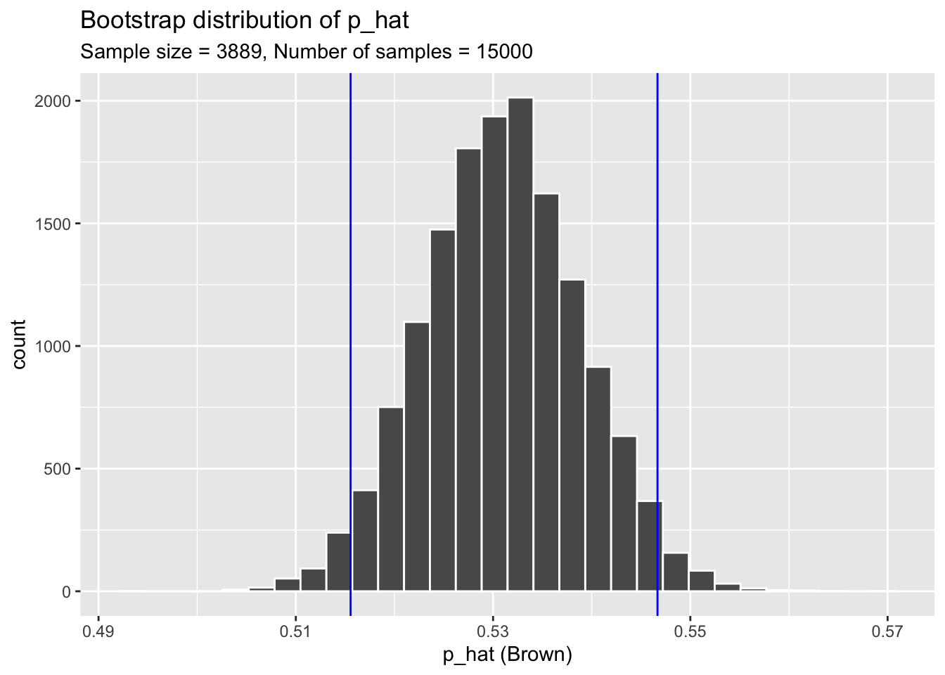
Exercise 1
There are two ways to interpret/report confidence intervals. State both (Remember these should be in context of the problem).
Exercise 2
Create a new graph that contains a 90% confidence interval. Change the vertical lines of the graph to a different color of your choice.
Exercise 3
In October 2009, 146 auctions on Ebay for the game Mario Kart on the Nintendo Wii were recorded. The data set is stored in the R package openintro. We are interested in the mean total price (auction price + shipping) of the sales. A preview of the data is below.
# Data
mariokart
# A tibble: 143 × 12
id duration n_bids cond start_pr ship_pr total_pr ship_sp seller_rate
<dbl> <int> <int> <fct> <dbl> <dbl> <dbl> <fct> <int>
1 1.50e11 3 20 new 0.99 4 51.6 standa… 1580
2 2.60e11 7 13 used 0.99 3.99 37.0 firstC… 365
3 3.20e11 3 16 new 0.99 3.5 45.5 firstC… 998
4 2.80e11 3 18 new 0.99 0 44 standa… 7
5 1.70e11 1 20 new 0.01 0 71 media 820
6 3.60e11 3 19 new 0.99 4 45 standa… 270144
7 1.20e11 1 13 used 0.01 0 37.0 standa… 7284
8 3.00e11 1 15 new 1 2.99 54.0 upsGro… 4858
9 2.00e11 3 29 used 0.99 4 47 priori… 27
10 3.30e11 7 8 used 20.0 4 50 firstC… 201
# ℹ 133 more rows
# ℹ 3 more variables: stock_photo <fct>, wheels <int>, title <fct># Column we are interested in
mariokart$total_pr [1] 51.55 37.04 45.50 44.00 71.00 45.00 37.02 53.99 47.00 50.00
[11] 54.99 56.01 48.00 56.00 43.33 46.00 46.71 46.00 55.99 326.51
[21] 31.00 53.98 64.95 50.50 46.50 55.00 34.50 36.00 40.00 47.00
[31] 43.00 31.00 41.99 49.49 41.00 44.78 47.00 44.00 63.99 53.76
[41] 46.03 42.25 46.00 51.99 55.99 41.99 53.99 39.00 38.06 46.00
[51] 59.88 28.98 36.00 51.99 43.95 32.00 40.06 48.00 36.00 31.00
[61] 53.99 30.00 58.00 38.10 118.50 61.76 53.99 40.00 64.50 49.01
[71] 47.00 40.10 41.50 56.00 64.95 49.00 48.00 38.00 45.00 41.95
[81] 43.36 54.99 45.21 65.02 45.75 64.00 36.00 54.70 49.91 47.00
[91] 43.00 35.99 54.49 46.00 31.06 55.60 40.10 52.59 44.00 38.26
[101] 51.00 48.99 66.44 63.50 42.00 47.00 55.00 33.01 53.76 46.00
[111] 43.00 42.55 52.50 57.50 75.00 48.92 45.99 40.05 45.00 50.00
[121] 49.75 47.00 56.00 41.00 46.00 34.99 49.00 61.00 62.89 46.00
[131] 64.95 36.99 44.00 41.35 37.00 58.98 39.00 40.70 39.51 52.00
[141] 47.70 38.76 54.51What is the estimated mean total price? The standard deviation?
Exercise 4
Create a bootstrap distribution using 5000 bootstrap samples. Display the bootstrap distribution in a histogram.
Exercise 5
Create a 99% confidence interval using your bootstrap sample.
Exercise 6
Create a new bootstrap distribution using a histogram, but denote the bounds of the 99% confidence interval.
Exercise 7
Suppose there where actually 500 sales for Mario Kart that month, and the 146 sales recorded were randomly selected from the 500. Interpret the confidence interval in context of the problem.